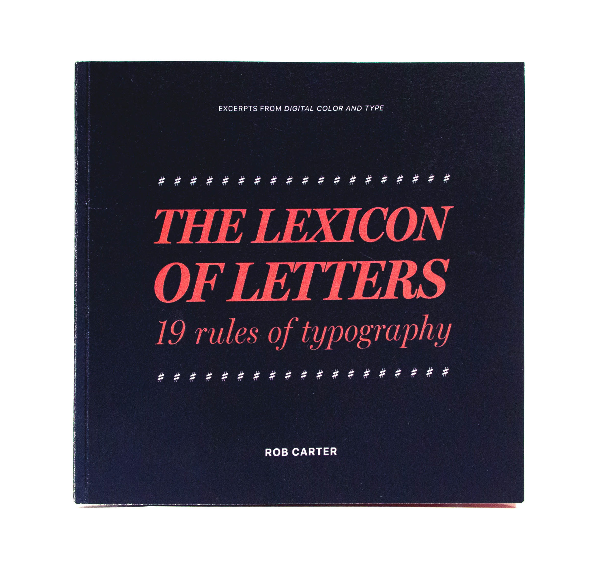
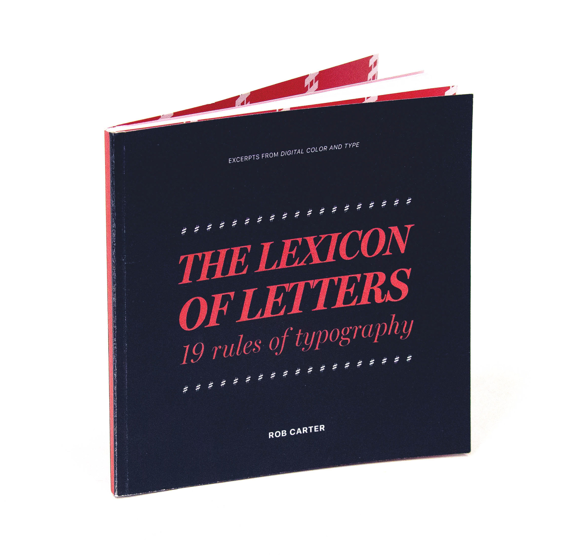
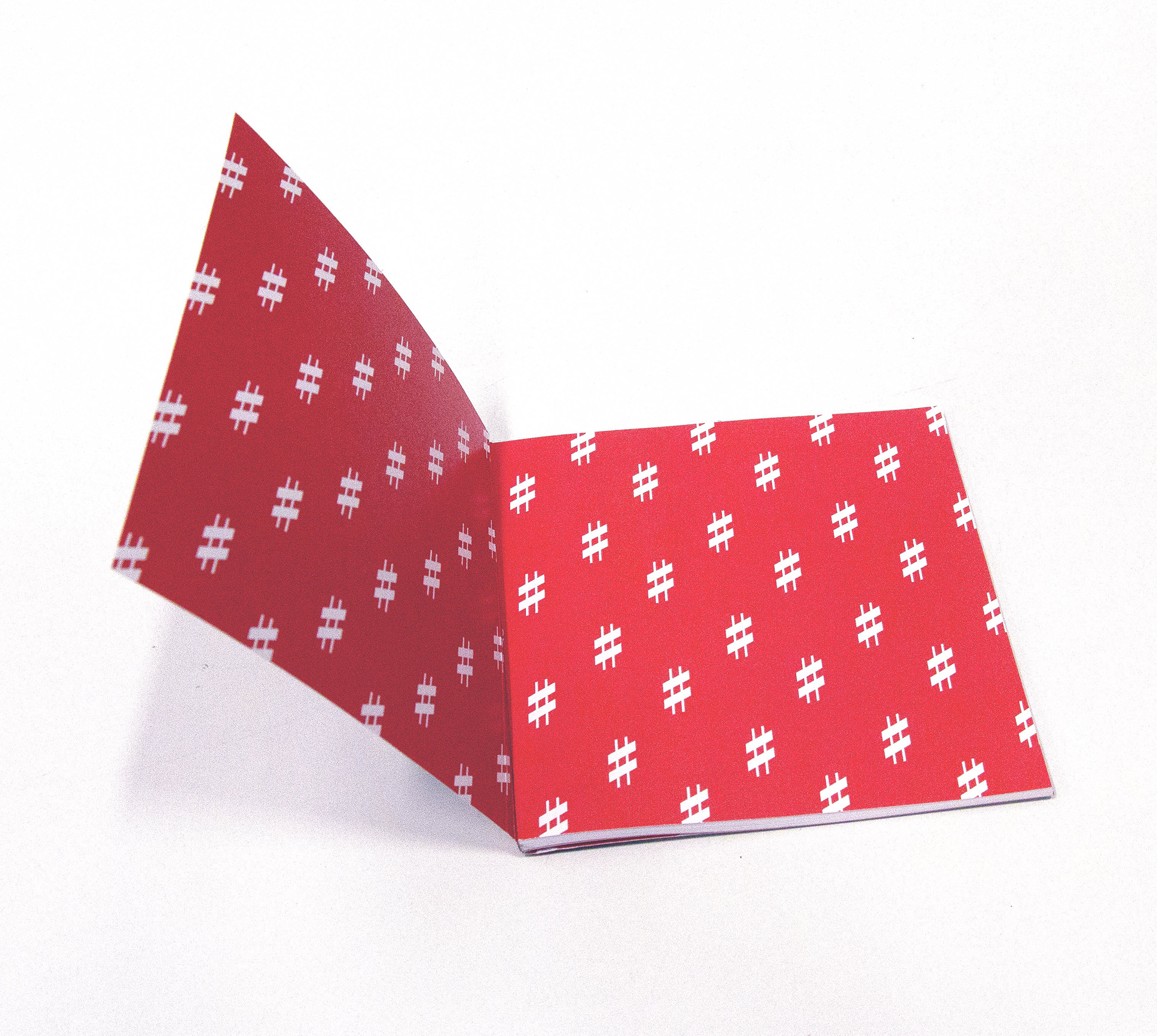
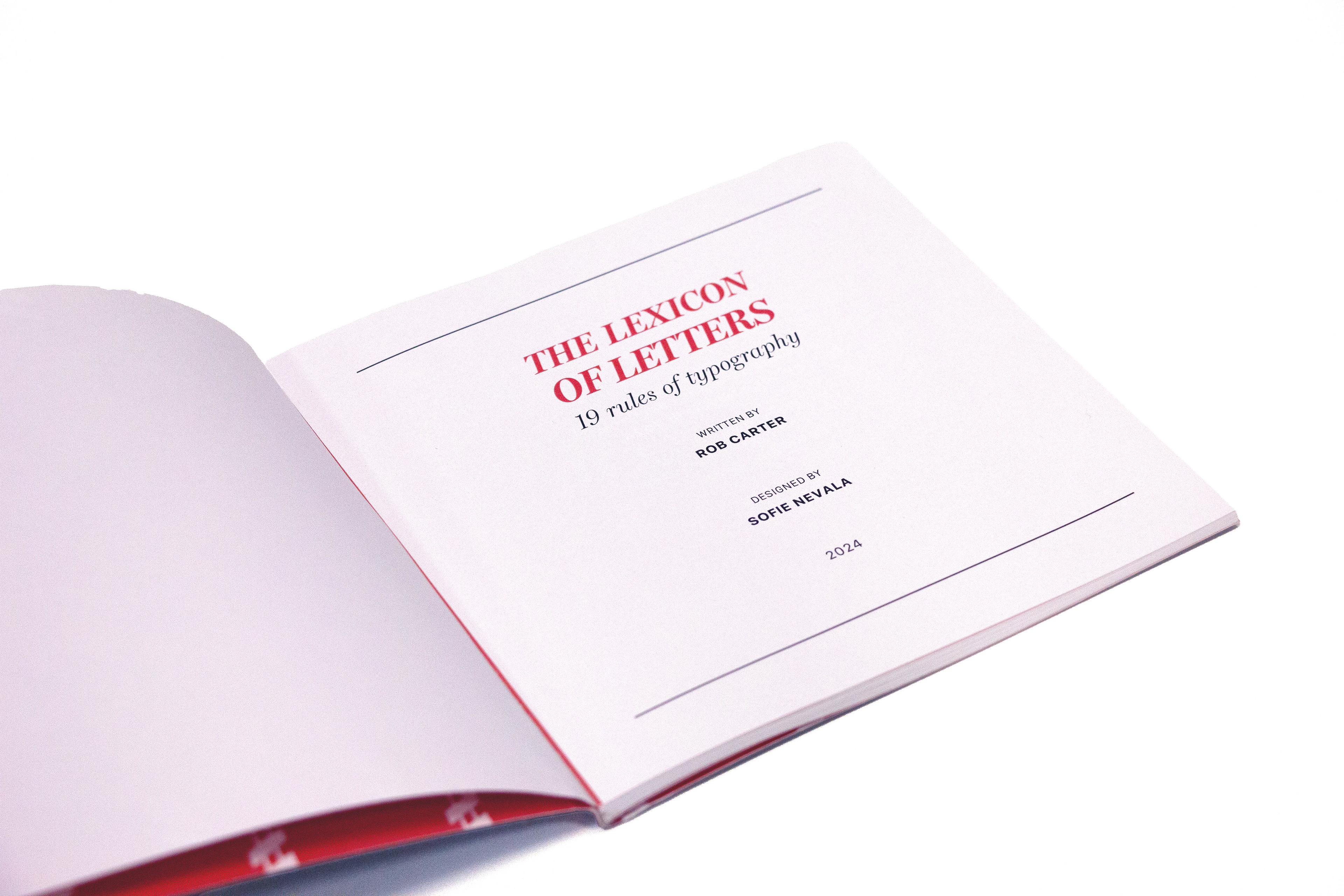
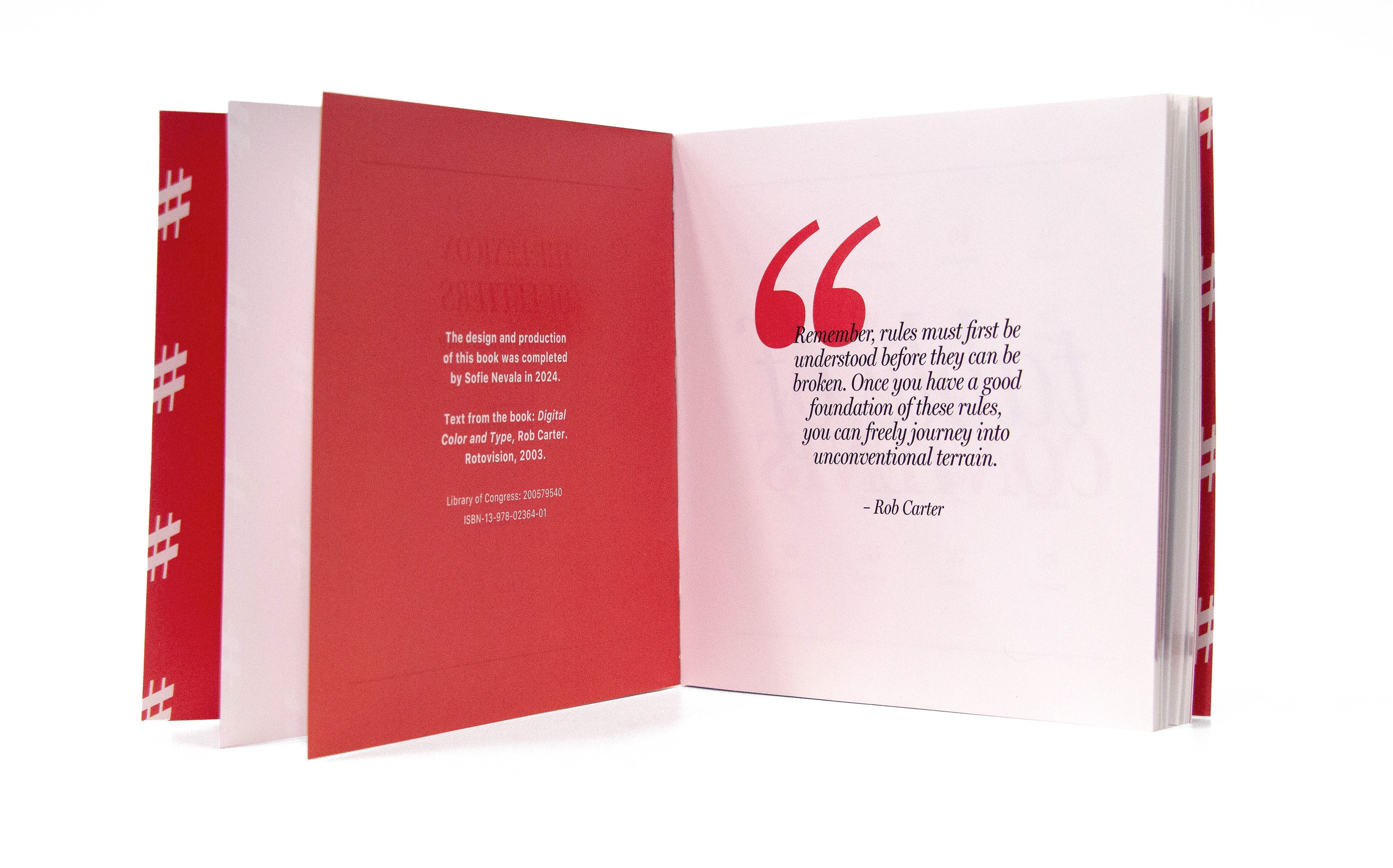
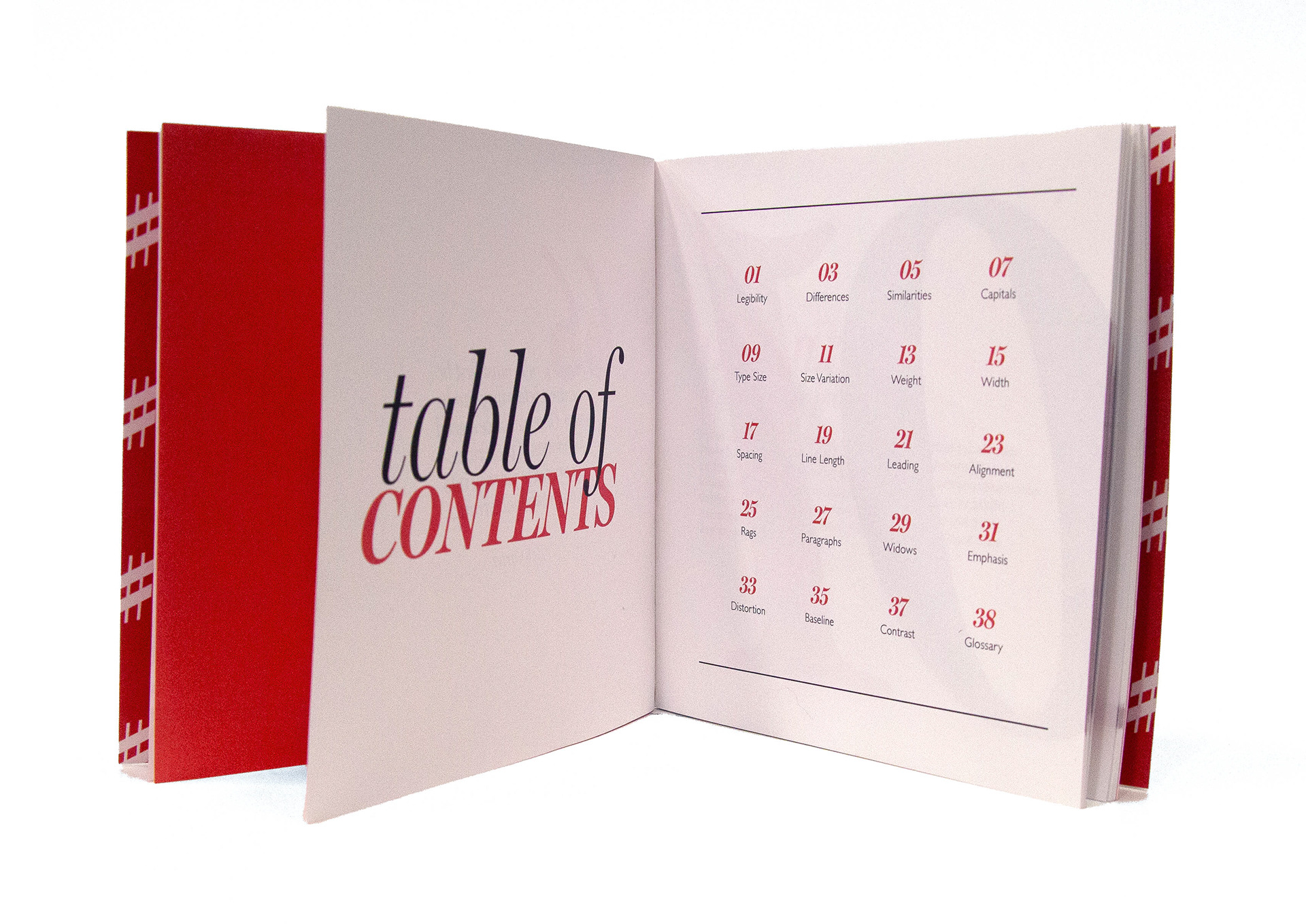
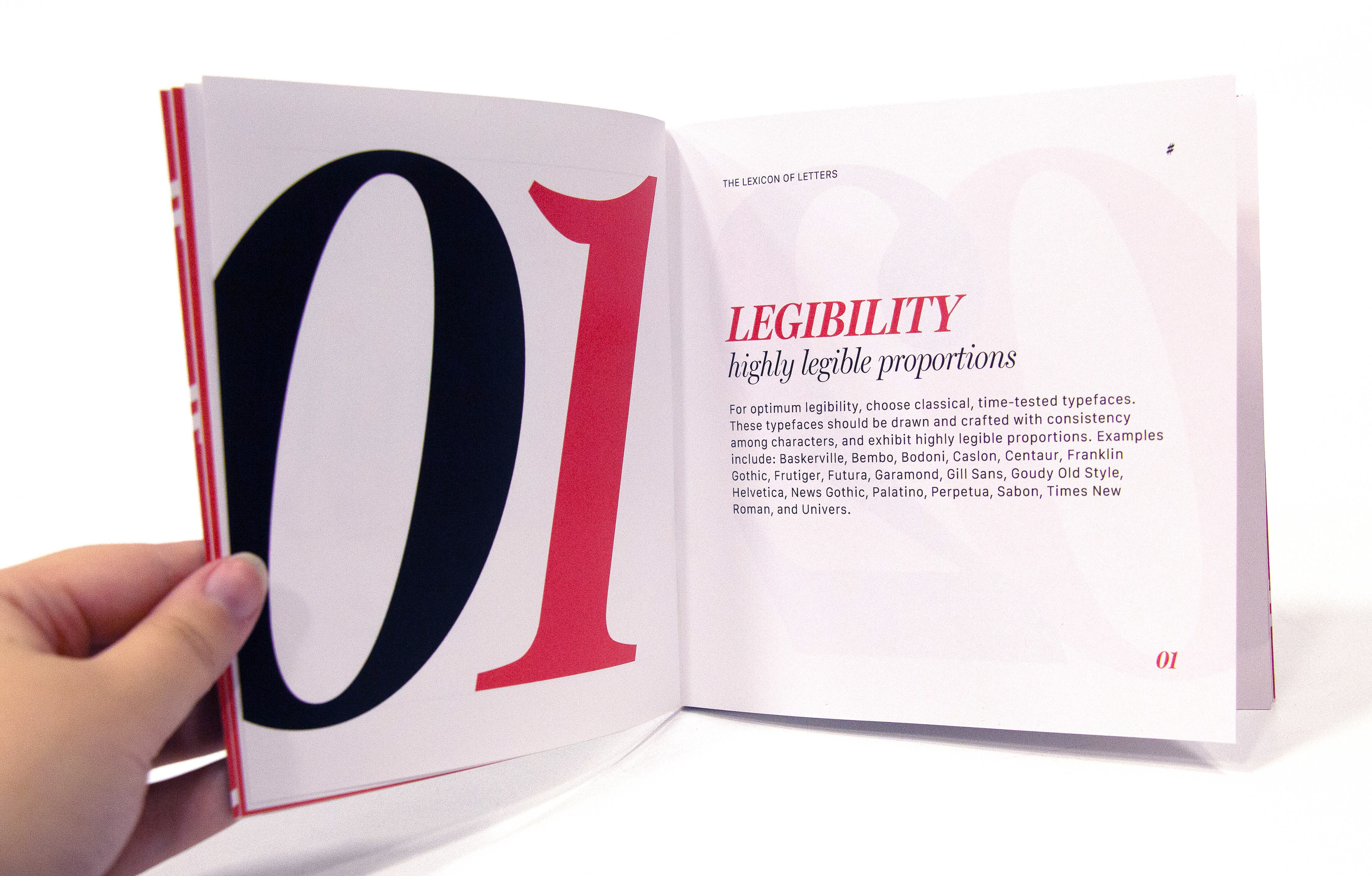
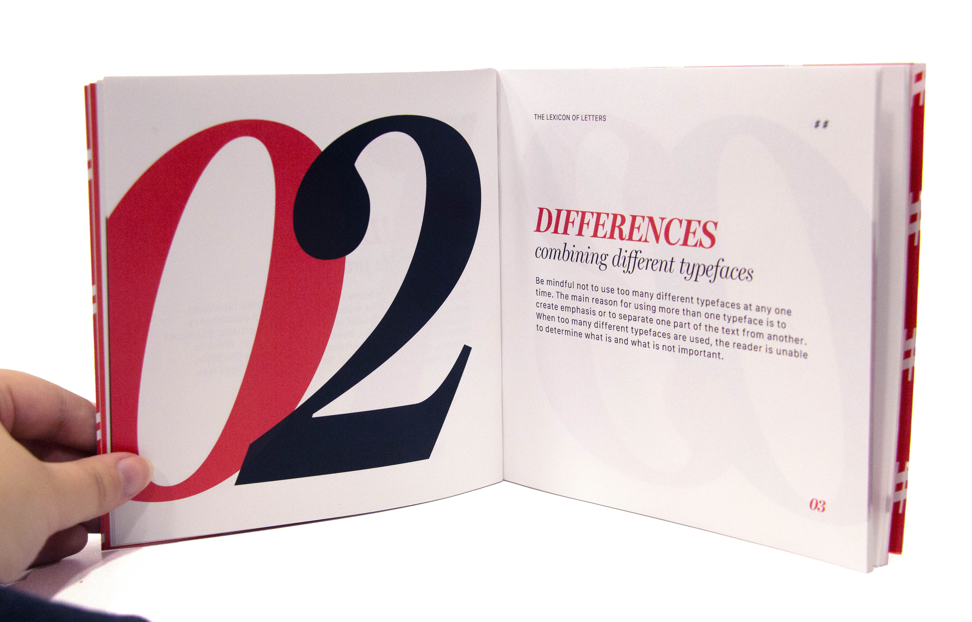
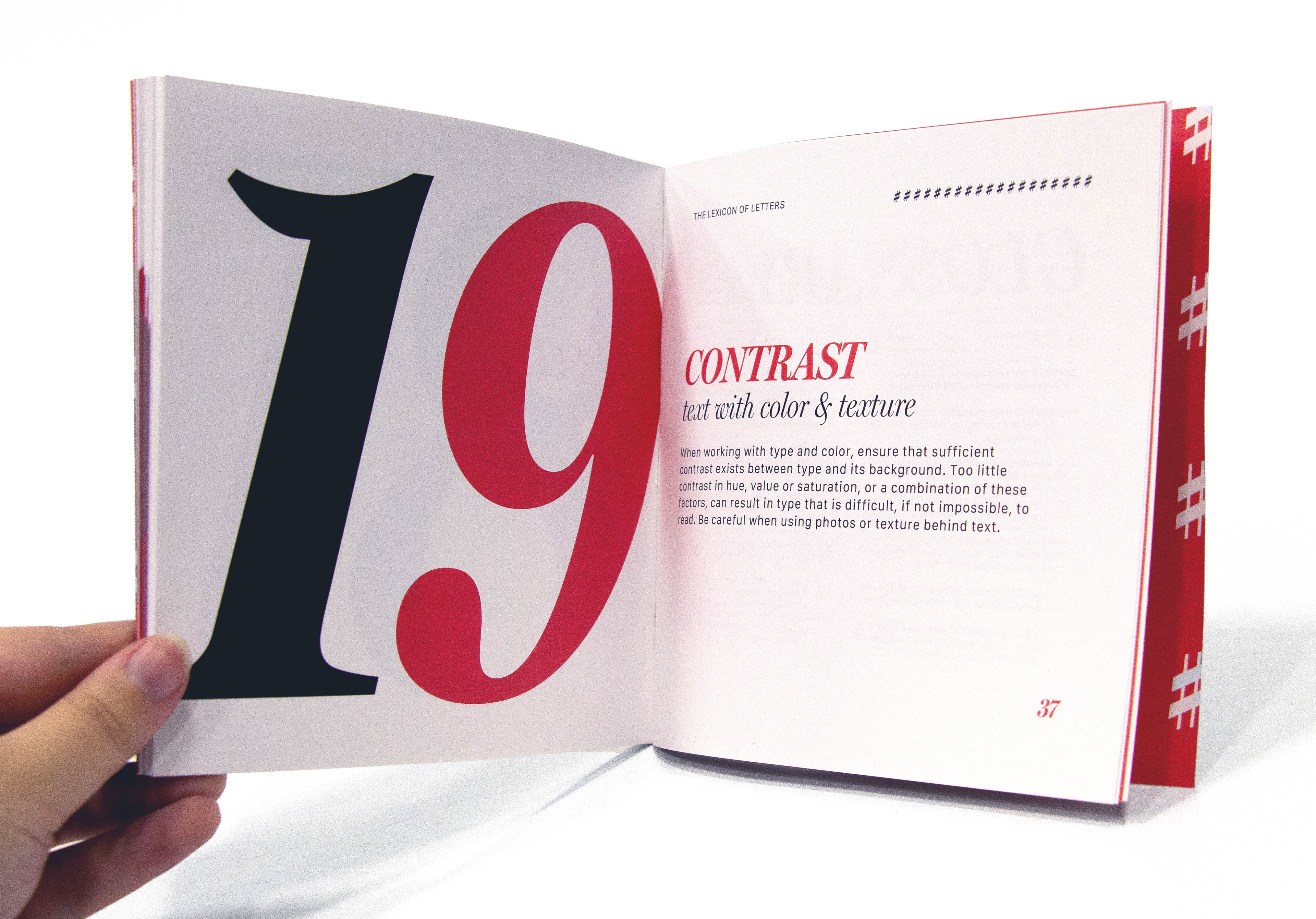
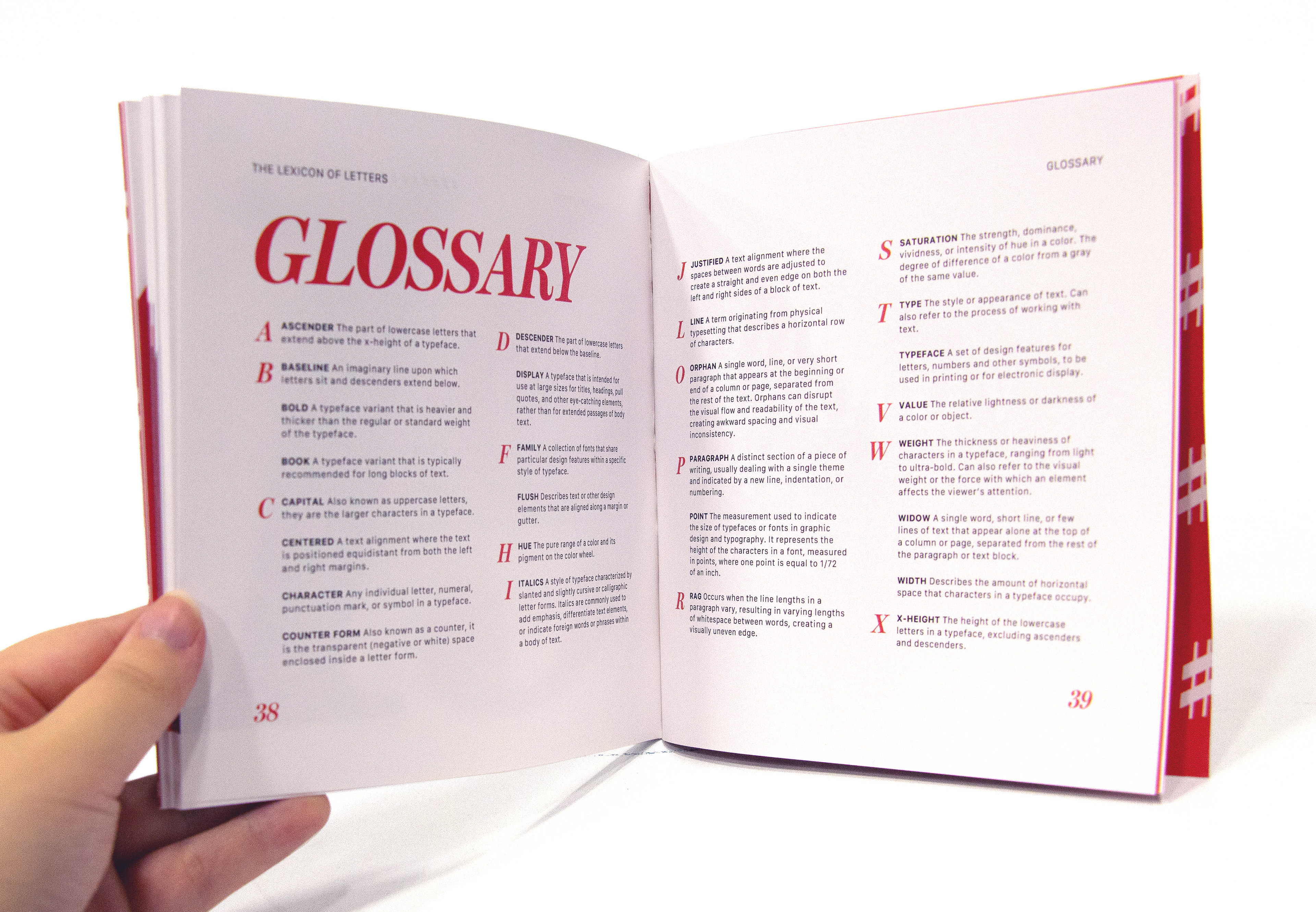
This project consisted of presenting an excerpt from Rob Carter’s The Lexicon of Letters: 19 Rules of Typography in a clear, yet evocative way with strong typographic hierarchy and fine-tuned typographic detailing.
I began by exploring different effective font and color pairings along with different page sizes and orientations. My final choices informed the typographic system I used throughout the book, including a consistent use of margins, hang-lines, numbering, and more.
