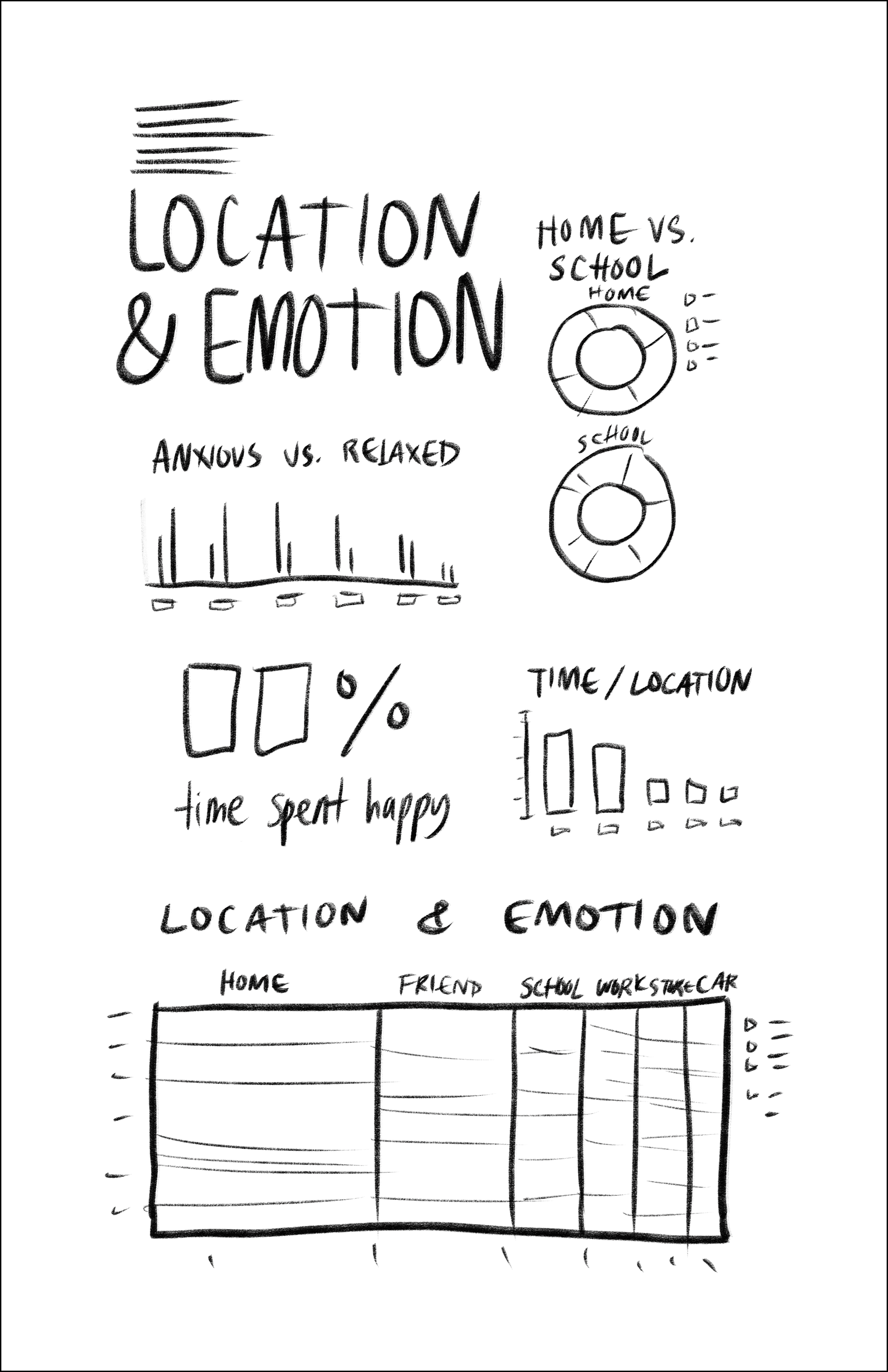
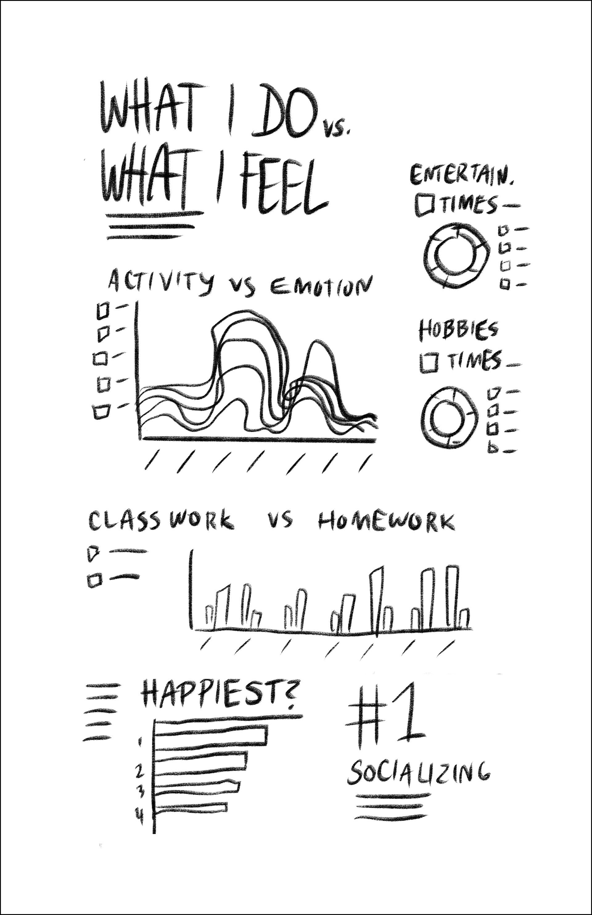
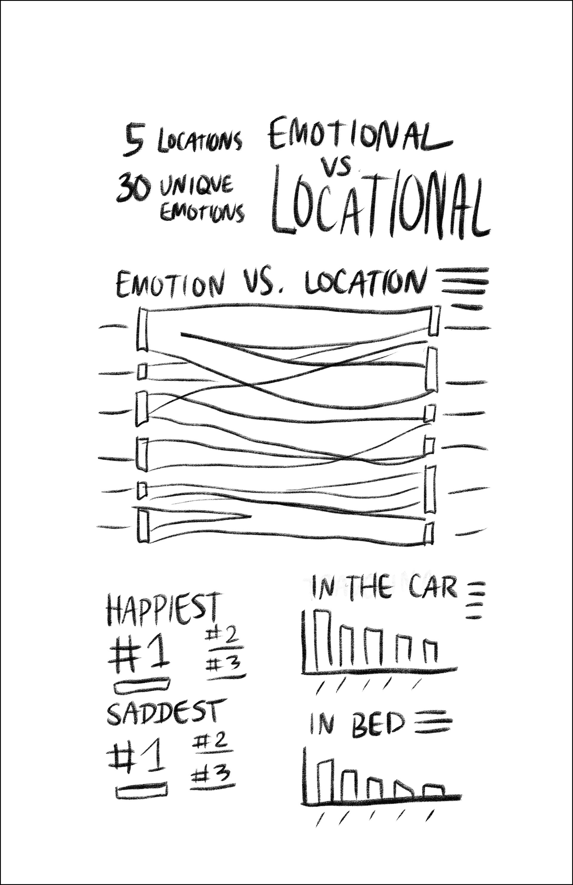
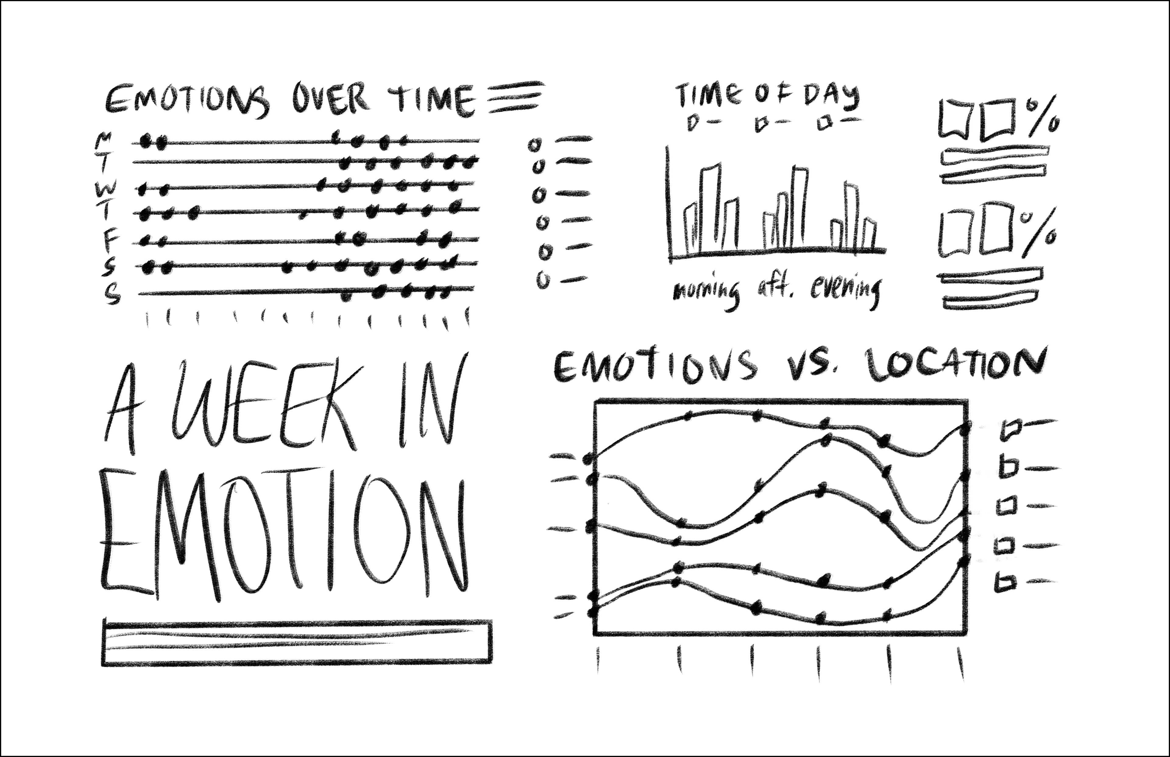
The Quantify Yourself project was focused on how to transform everyday data into a compelling infographic. I chose to focus on how my emotions related to the location that I was at.
I tracked my location and emotion every hour that I was awake for one week. As I began assembling my infographic, I condensed similar emotions into larger emotion groups. Similarly, I grouped similar locations into larger categories. I took a modular approach to designing, pulling out comparisons that I found interesting and/or unexpected.
